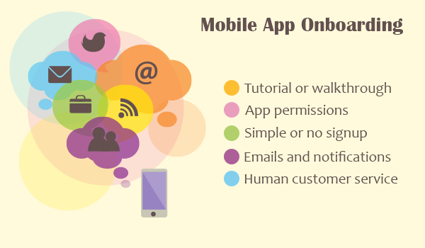
User onboarding basically means getting first time visitors to turn into actual users on your site or app. While the product or service you are selling might be great, you need to keep in mind that there is a lot of competition out there. You need to show your customers that your product is what they want and you need to do this at the earliest stage possible in the onboarding process. In other words, you want to take your customers to that ‘a-ha’ moment that makes them decide they want to use your product or service. How do you do this? Here are 7 techniques that can give you those conversion rates you desire.
1. Make Signing Up Easy
(via useronboard.com)
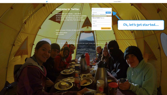
Just ask yourself this; would you rather get stuck in traffic or go through the long and tedious prospect of signing up for another product or service? Yes, I think we both know what the answer would be. So why make your customer go through that whole rigmarole? Only ask for information that is relevant to you and your product. It’s probably a good idea to embed the form on your homepage, prefill your forms and provide inline form validation. Look at how Twitter does their onboarding process.
2. Social Login
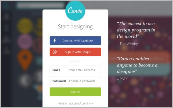
This is a great way to let customers sign in using pre-existing profiles from Facebook, Twitter, Google and so on. It allows them to sign-up in one click. This also ensures that they won’t leave your website if they have forgotten their login information. And the advantages don’t end here. Social Login also provides you access to a user’s contacts or friends. According to surveys, 72% of those surveyed said that they would think about buying something that their friend had recommended online. Another 78% said that they arrived at a website based on what they saw of it on their social network. Pinterest, Canva and Quora are three great example sites that offer Social Login to make signing up easier.
3. Assumptions – Not Good
(via kissmetrics.com)
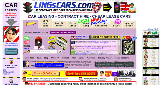
Never assume that visitors know what your site is about. Always ask yourself whether or not your grandma knows what your product or service does. It doesn’t have to be a long and complicated explanation. However, ensure you have a headline and a subheading that tells anyone who drops by what they’re signing up for. Visuals also help in making it clear to potential customers what exactly you can do for them. Just make sure that your homepage is not too cluttered and doesn’t confuse the customer with too many calls-to-action. The homepage of Tumblr is a classic example of what to do. The businesslike setup tells users what they can expect and offers them a basic form they can use to sign-up. Of course, the social proof at the bottom definitely helps.
4. Remember Their Security Concerns
(via emerchantbroker.com)
Some customers may just not be comfortable with using a universal login such as Facebook. Respect that and provide an alternative. Let them create a personal login specific to your site. Again, don’t make this process tedious for them. Try aligning your sign-up form from left to right as it is easier to read that way. Also make sure you provide microcopy for any fields that require it such as passwords, date of birth and so on. Once again, Tumblr has some good microcopy on its sign-up form and even provides information on what kind of password they want (letters, numbers, special characters etc.) and how strong the password is.
5. Make it Personal
If your customers have logged on using Social Login, you have an excellent opportunity to customize their experience on your website based on their interests. You can greet them with their name and profile picture. You can also design content that caters to their interests. Statistics indicate that 6 out of 10 customers felt they knew more about a company and felt good about it if it had custom content tailored to them.
6. Tutorials/tools
(via designmodo.com)
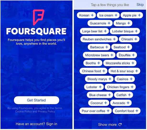
Help users create habits that keep them coming back for more. This is where tutorials/tools come in. Successful websites share something in common – they walk the new user through their interface so that the newbie is not just comfortable using their website, but also understands the purpose of the why it exists. This can be seen in the case of Pinterest and Tumblr, both of which require a new user to go through the steps of pinning or selecting their blog topics respectively. Tumblr tells the user to select 5 blogs that they want to follow. Users have the option of typing in their interest in the search bar to bring up relevant blogs. In any event, the page is fairly self-explanatory and makes it clear about what needs to be filled and where the selections are. As the user selects blogs, Tumblr updates the requirement count and even allows the user to ‘cheat’ once they have selected four blogs. At this point, Tumblr lets the user skip a blog and go to the next step.
7. What is the Value?
(via useronboard.com)
Once we are logged on to the internet, pretty much everyone starts to suffer from ADHD. What this means for you is that you don’t have pages to convince the user that your website is the one they want to stay with. Showing them the value of your product is important, but when you show them this value is also essential. The earlier, the better – remember the short attention spans. Twitter is a good example of this. It ensures that a newbie follows at least 10 other users before they can use the network on their own. Profiles to follow are based first on popularity and then on topics of interest.
Dropbox also adds on a subtle call-to-action by asking the user whether they’d like to upgrade. The options displayed are pretty simple and self-explanatory for anyone who knows how many megabytes of data they plan to use and share.
Of course, these are more generic steps. The actual process of user onboarding will depend on your business model and your target audience. One size doesn’t fit all, so pick and choose what works for you but remember that the general principles remain the same – find out what your users need, how to get them onboard and how to get them to complete the process.
(Head Image: intercom.io)

